Enhancing Clinical Decision-Making with AI-Driven Precision and Communication.
AI Based Health Records
COMPANY
Millipixels Interactive
ROLE
Associate UX Designer
EXPERTISE
UX Design
YEAR
2019
CONTEXT — COMMUNICATION AT THE POINT OF CARE
In a busy hospital, the difference between a good outcome and a bad one often comes down to minutes, and who had the right information at the right moment. Nurses have critical observations. Doctors have clinical authority. And between them, the communication system was a patchwork of verbal handoffs, paper notes, and fragmented digital records.
The question wasn't whether technology could help. It was whether it could help without adding more friction to people who already had none to spare.
Healthcare communication has a fundamental problem: the people who observe patients and the people who make decisions about them are often different people, working different shifts, under different pressures.
THE PROBLEM
Nurses document continuously. Doctors review selectively. The gap between what's recorded and what's communicated, and when, is where critical information gets lost.
Existing EHR systems were largely built as record-keeping tools. They stored information well. They surfaced it poorly. And they offered almost no support for the kind of real-time, contextual communication that clinical decision-making actually requires.
The project was initiated to change that, to design an AI-powered EHR that could act as a genuine communication bridge, not just a data repository. And to do it in a way that worked for nurses, doctors, and support staff simultaneously.
How might we help healthcare workers communicate with each other without friction?
TARGET USERS
Three distinct groups needed to be served nurses, doctors/providers and other hospital staff each with different workflows, mental models, and information needs within the same system.
RESEARCH
Understanding the clinical environment
The project began with immersive research, not just into what the system needed to do, but into what a hospital day actually looked like for the people who would use it.
I conducted qualitative research with nurses and doctors across different hospital departments, observing workflows, mapping handoff moments, and understanding the information needs at different points in a patient's care journey.
What the research revealed
Communication breakdowns weren't about missing information they were about timing and form.Nurses were documenting everything. Doctors weren't always seeing what mattered, when it mattered. The EHR was a passive repository when it needed to be an active communicator.
The cognitive load on nurses was already at its limit. Any new system that added documentation steps, however small, would be resisted. The design had to reduce load, not add to it.
AI had to earn trust before it could be useful.Clinicians were sceptical of AI-driven recommendations not unreasonably. The system needed to present AI insights in a way that supported clinical judgment rather than competing with it.
Role-appropriate information was critical.Nurses and doctors needed different views of the same data. A single interface trying to serve both would fail both.
THE SOLUTION
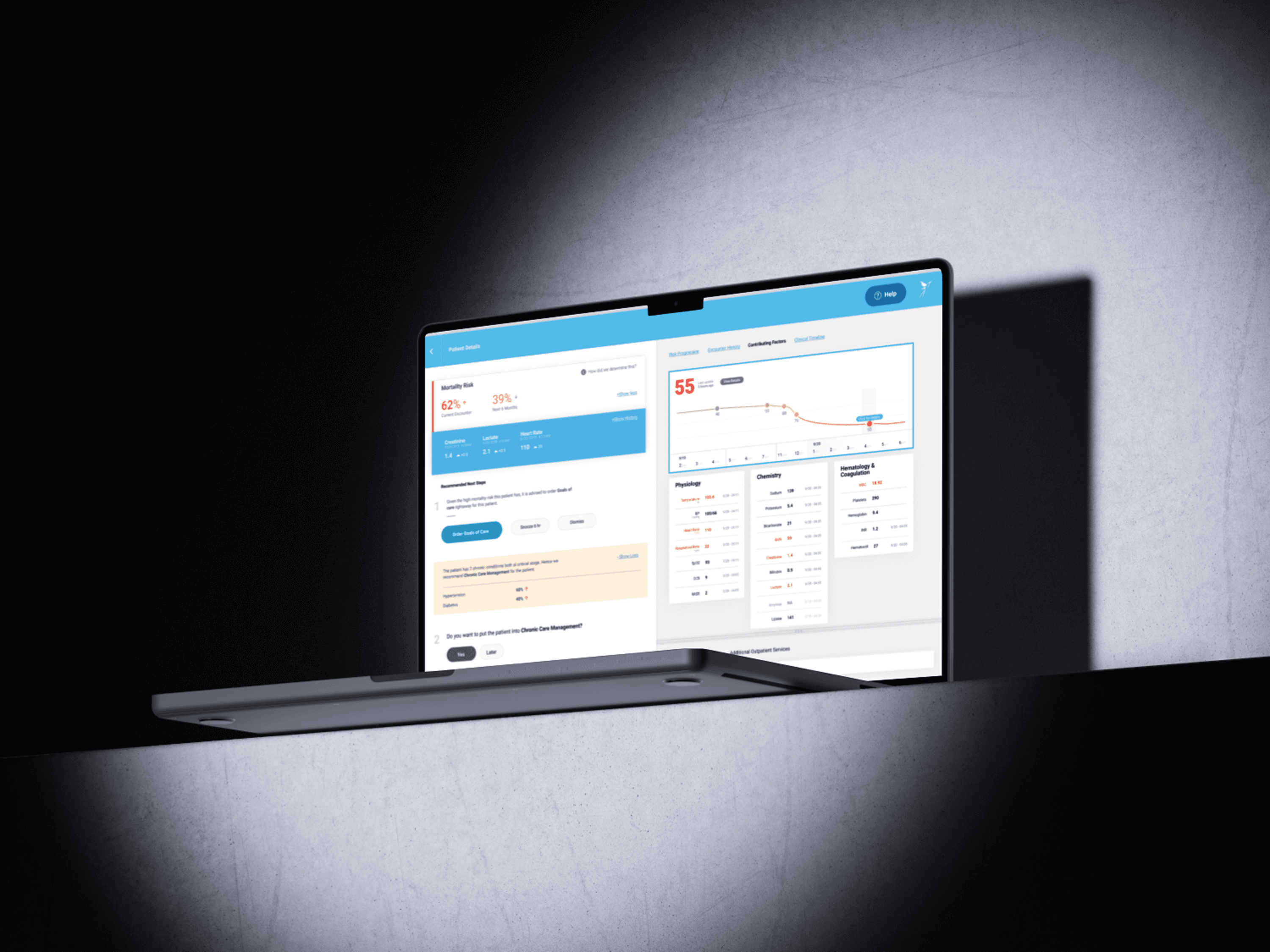
The AI Based EHR was designed around three principles: observe passively, surface actively, decide transparently.
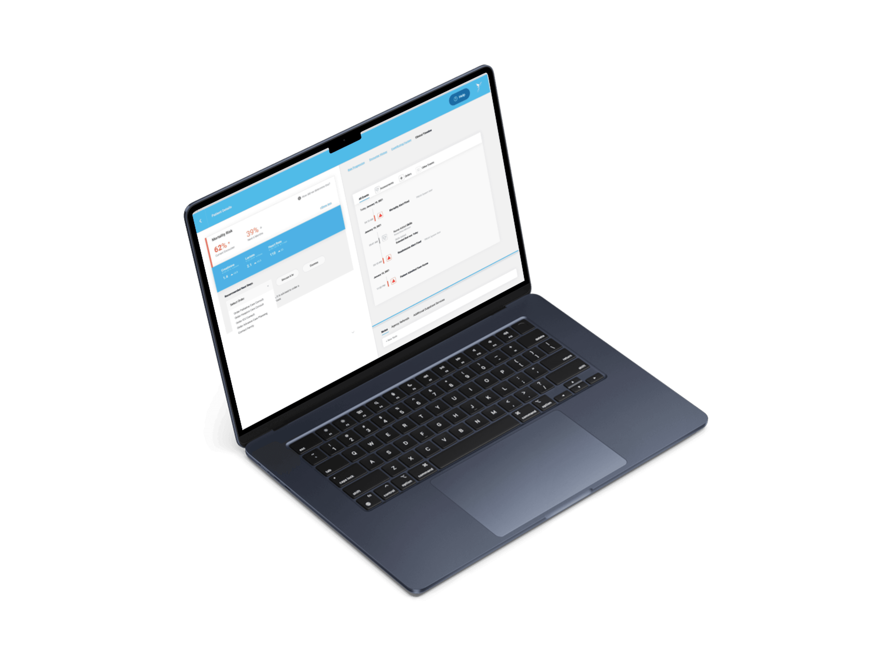
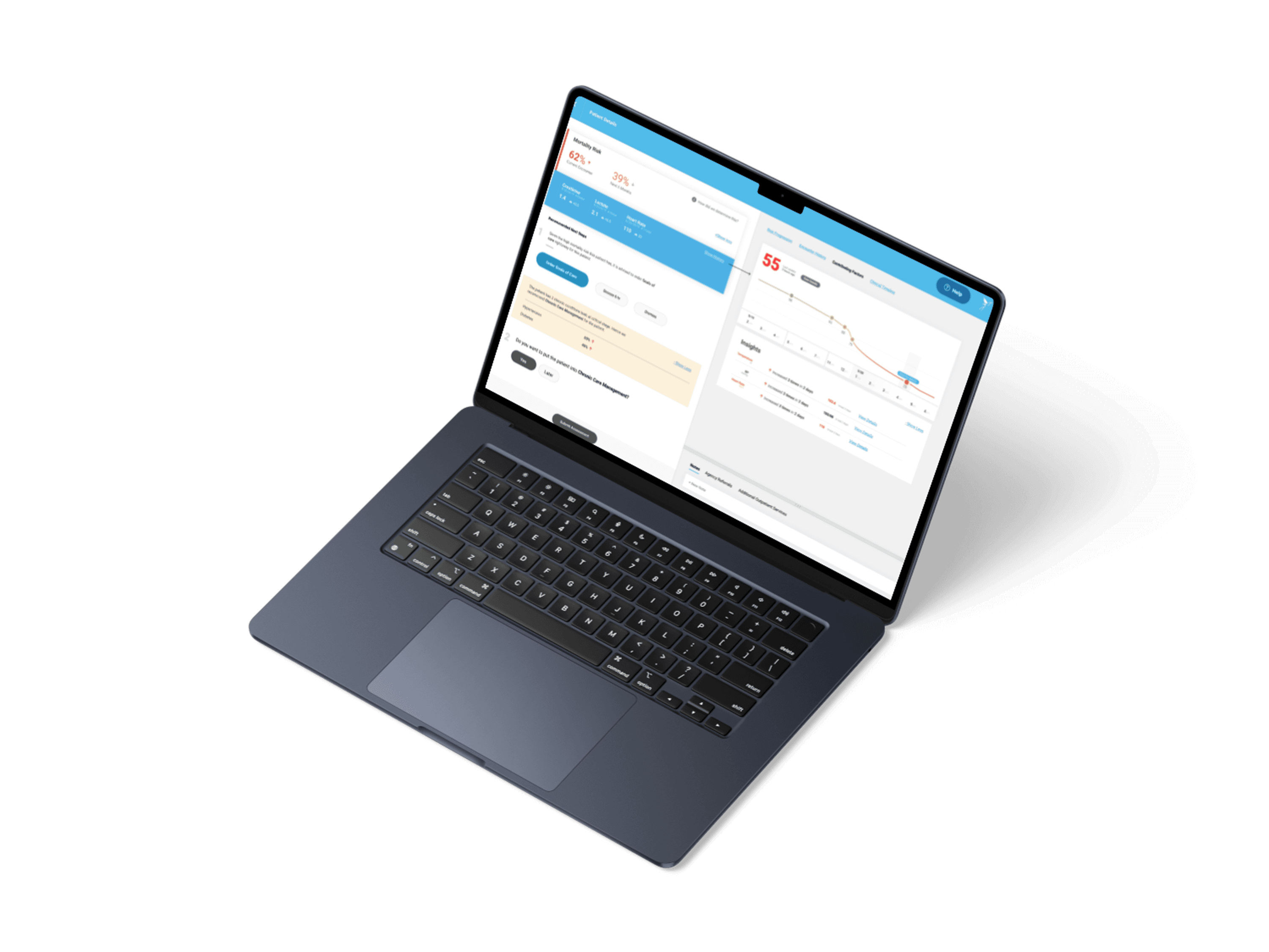
AI-assisted clinical flags: Rather than generating alerts that interrupted workflow, the AI surfaced contextual signals, changes in patient data patterns, communication gaps, escalation indicators, at natural decision points in the interface. Clinicians saw the flag, saw the reasoning, and made the call themselves.
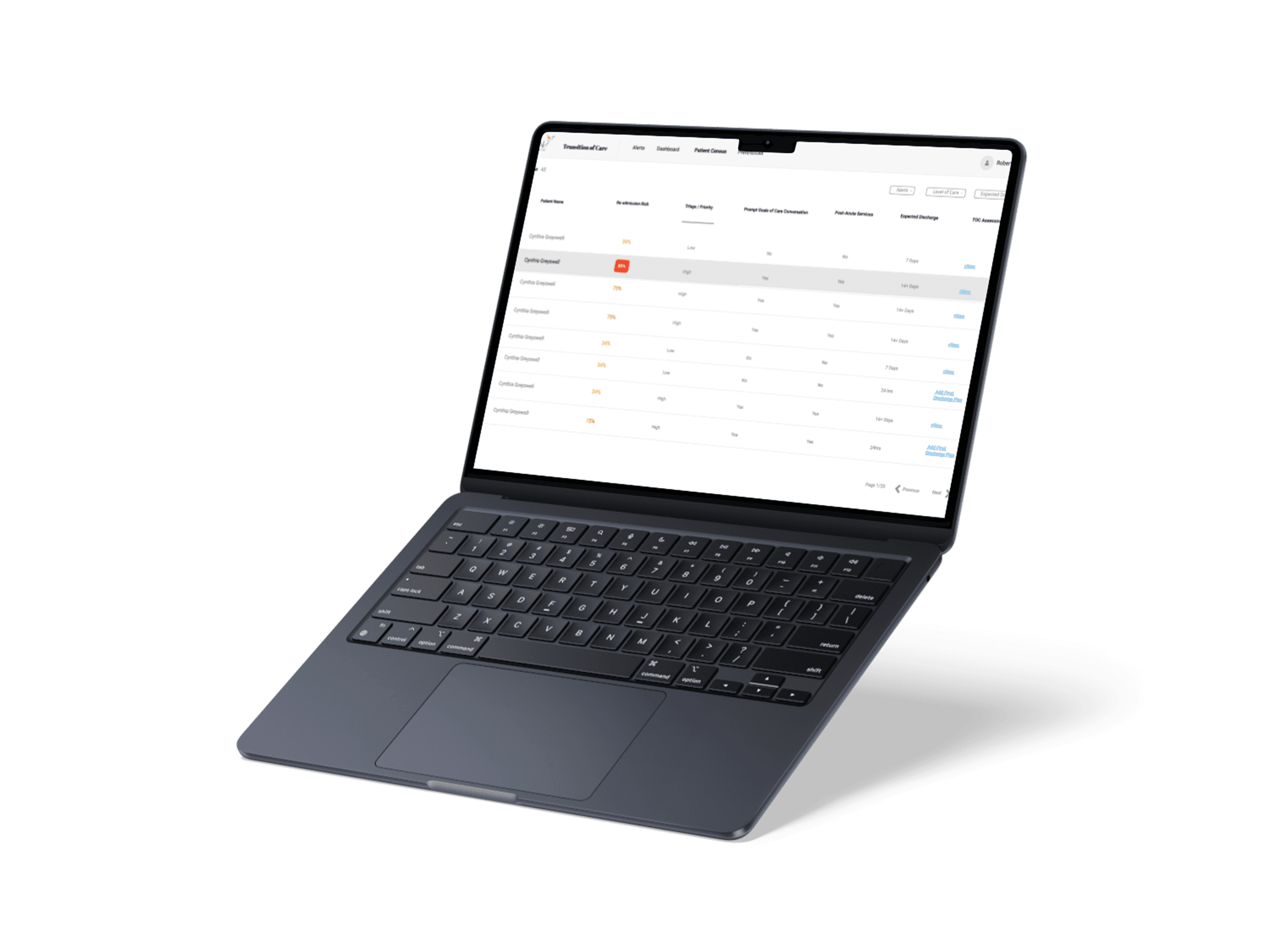
Role-differentiated views: Nurses saw a documentation-optimised interface, fast entry, clear status, minimal steps. Doctors saw an analysis-optimised interface, patient summaries, trend data, AI insights, and clear escalation pathways. Both accessed the same underlying record; neither was burdened by the other's information needs.
Structured nurse-to-doctor communication: The EHR included a structured handoff module that replaced verbal and paper-based communication with a consistent, timestamped digital record, visible to both parties, surfaced in context, and linked to the patient record it described.
Design system: A full design system was built to ensure consistency across all modules, critical in a clinical context where visual inconsistency can create confusion at exactly the wrong moment.
RESULTS
The product was developed and deployed by the client's frontend and backend teams following QA validation.
Qualitatively, the design achieved its core goals:
- Nurses reported the documentation flow as significantly faster than the previous system
- Doctors responded positively to AI insights being presented with visible reasoning, the transparency reduced skepticism
- The structured handoff module was cited as one of the most immediately valuable features, replacing a process that had previously relied entirely on individual memory and verbal communication
The role-differentiated interface meant neither group felt they were navigating a system built for someone else — a common complaint with single-view EHR implementations.
THE DESIGN CHALLENGE
The core challenge wasn't technical, it was about trust and timing.
How do you design a system that surfaces the right information to the right person at the moment they need it, without adding noise, without undermining clinical authority, and without disrupting the rhythms that healthcare workers depend on to function under pressure?
The AI layer made this harder. Any feature labelled "AI" carries expectations, and scepticism. The design had to make the intelligence feel helpful and transparent, not opaque or presumptuous.
WHAT I LEARNED
Healthcare UX demands a level of discipline that consumer product design rarely requires. Every decision, how a flag is labelled, where a button sits, how much cognitive load a screen carries, has real stakes.
The most important lesson was about the difference between surfacing information and demanding attention. Alert fatigue is one of the most documented problems in clinical software. The AI layer only worked because it was designed to support decision-making, not to trigger action. The moment a system starts feeling like it's telling clinicians what to do, they stop trusting it entirely.
The other lesson was about the value of role-specific design. It would have been faster to build one interface and ask both nurses and doctors to adapt. But the research made clear that their information needs, their workflows, and their relationships with the system were fundamentally different. Designing for both, separately, was what made the product usable for either.
IDEATION & VALIDATION
With the research brief established, I moved to ideation, exploring how the interface could serve communication, not just record-keeping.
Early concepts focused on:
- How AI-surfaced insights should be presented alongside clinical data without creating alert fatigue
- How the nurse-to-doctor handoff could be structured within the EHR itself
- What role-appropriate views should look like for nurses, providers, and support staff respectively
Concepts were tested iteratively with clinical users. Feedback from nurses centered on speed and simplicity, they needed to document in seconds, not minutes. Feedback from doctors centered on confidence, they needed to understand where an AI flag came from before acting on it.
Multiple rounds of wireframes were developed, tested, and iterated before moving to high-fidelity design. Each round tightened the interface and sharpened the AI presentation.
Qualitative User Research · Contextual Inquiry · Competitive Analysis · Journey Mapping · Information Architecture · User Flows · Business Rules · Wireframing (Lo & Hi-Fi) · Interaction Design · Prototyping · Design Systems · Documentation · Cross-Functional Collaboration