From a dropdown to a workspace.
Study Management System
COMPANY
Energy Exemplar
ROLE
Senior UX Designer
EXPERTISE
UX Design | End-to-End Ownership | User Research
YEAR
2025
CONTEXT — THE DROPDOWN THAT GREW TOO BIG
In energy market simulation, data is everything. Every forecast, every grid decision, every scenario a team runs is built on a dataset what PLEXOS calls a Study. Without selecting a study, users can't do anything in the product at all.
For years, that selection happened through a dropdown in the header. It worked — until it didn't.When PLEXOS was first built, the number of studies a team managed was small enough that a dropdown made sense. It sat in the header, always accessible, always one click away. Users selected their study, got to work. Simple.
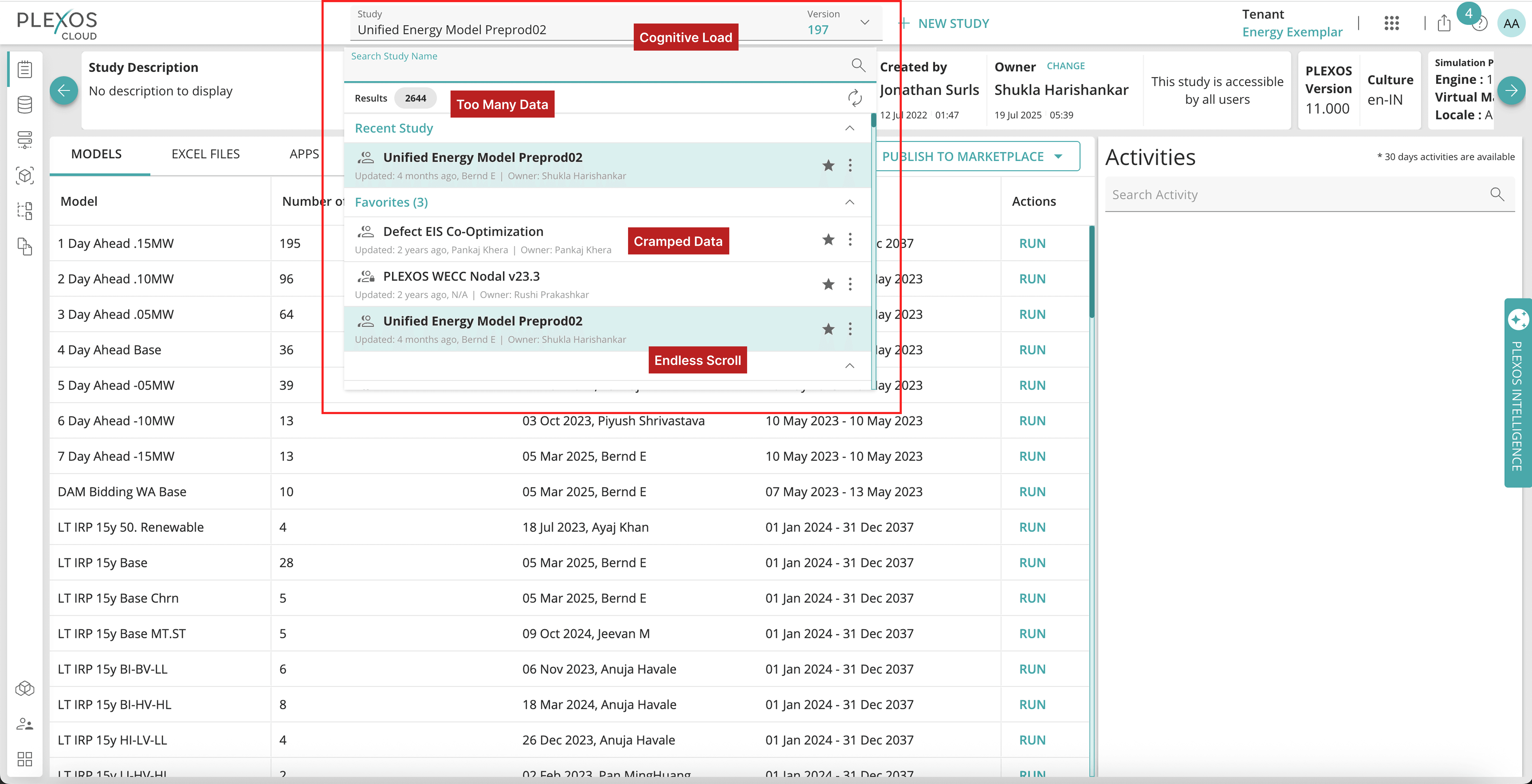
Over time, that assumption broke down. As teams grew and simulation workflows matured, the number of studies ballooned. For larger enterprise teams, it wasn't uncommon to have over 100 active studies in that dropdown. Scrolling through them to find the right one became a task in itself. And the dropdown designed for a handful of items had no real answer for that scale.
Worse, any new feature that touched study management better search, categorization, lifecycle controls would have to be crammed into a UI pattern that was already at its limit. The dropdown wasn't just a usability problem. It was a ceiling on what the product could become.
The brief wasn't just to redesign the dropdown. It was to replace the mental model entirely and do it without breaking the workflow of users who had been relying on that dropdown for years.
RESEARCH
Starting with Pendo
Before any interviews, I went into Pendo to understand how the dropdown was actually being used.
The usage data confirmed one thing immediately: this was not a feature users could ignore. Because selecting a study is a prerequisite for doing anything in PLEXOS, the dropdown had near-universal engagement. The question wasn't whether users used it, it was how, and what they were trying to do when they hit its limits.
The Pendo data showed which elements inside the dropdown were getting the most interaction: study name, owner, creator, source, favourites, the search bar, and the kebab menu for archive and rename actions. This told me what information users were relying on to identify and manage studies and what the new system would need to carry forward without losing the existing functionality.
Session recordings gave me the texture behind the numbers. I could see users scrolling through long lists, using search as a crutch to find studies they should have been able to locate at a glance, and in some cases losing track of which study they were working in altogether.
User Interviews
I ran interviews to understand how teams actually structured and used their studies day-to-day. Three things stood out:
Managing large numbers of studies had become a job in itself.Users at larger organisations weren't just selecting studies they were trying to maintain them, track their status, find the right ones quickly, and clean up old ones. The dropdown gave them none of the tools to do that.
Deletion was a dependency problem.Previously, only tenant admins could delete studies. For users who had accumulated dozens of outdated or redundant datasets, getting rid of them meant raising a request with an admin and waiting. It was a friction point that came up unprompted in almost every interview.
The dropdown had become a trust issue.When users couldn't find a study quickly, they weren't sure if it was missing, renamed, or just buried. The lack of structure made the most important feature in the product feel unreliable.
Focus Group to Understand Study Lifecycle
During usability testing (covered below), one finding surfaced that I didn't have a clear answer for: users were confused by a study status feature and didn't find it useful. Rather than assuming it was a design problem, I ran a focus group discussion specifically to understand how users thought about the lifecycle of a study how it was created, used, evolved, archived, and retired.
The focus group revealed that status meant different things to different teams. Some had informal conventions; others had none at all. Analysts used to rename the studies to add a study status.
The concept of a formalised status system was more novel than we'd assumed, and needed more definition before it could be designed effectively. This became a recommendation for a follow on phase rather than a problem to solve in the current scope.
THE DESIGN CHALLENGE
The core challenge in this project wasn't visual it was cognitive.
Users had a deeply ingrained habit: go to the header dropdown, find their study, get to work. Any new system would need to earn their trust and attention before they'd change that pattern. A full replacement that appeared overnight would create confusion and resistance, regardless of how well-designed it was.
The challenge was to build something genuinely better while giving users a bridge between what they knew and what was coming.
THE SOLUTION — Study Management System
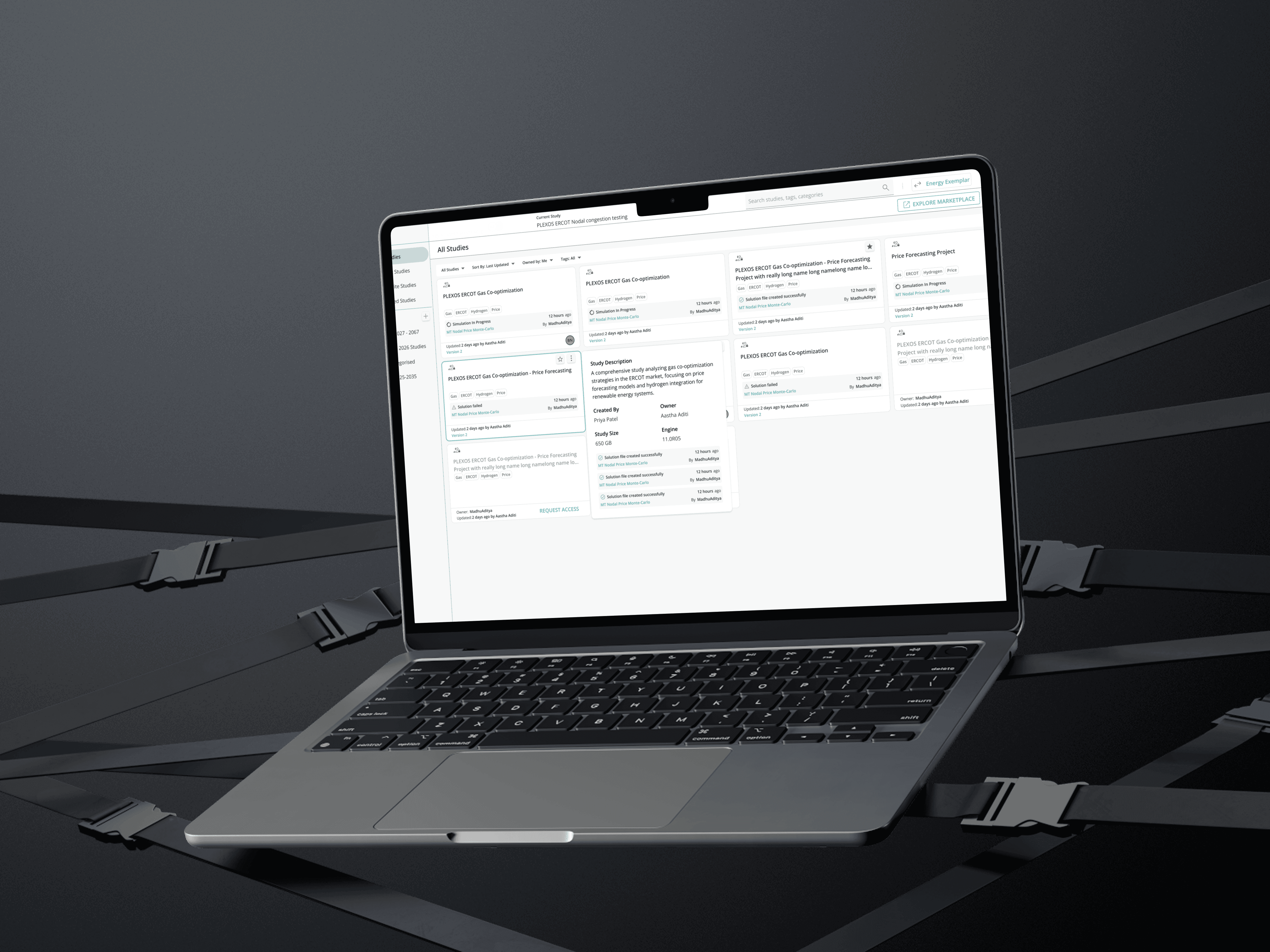
The dropdown was retained as a lightweight entry point, but now with a constrained view showing only the 3 most recent studies, making it fast for the common case while naturally directing users to the full Study Management page for anything more complex.
The Study Management page itself was the core of the work.
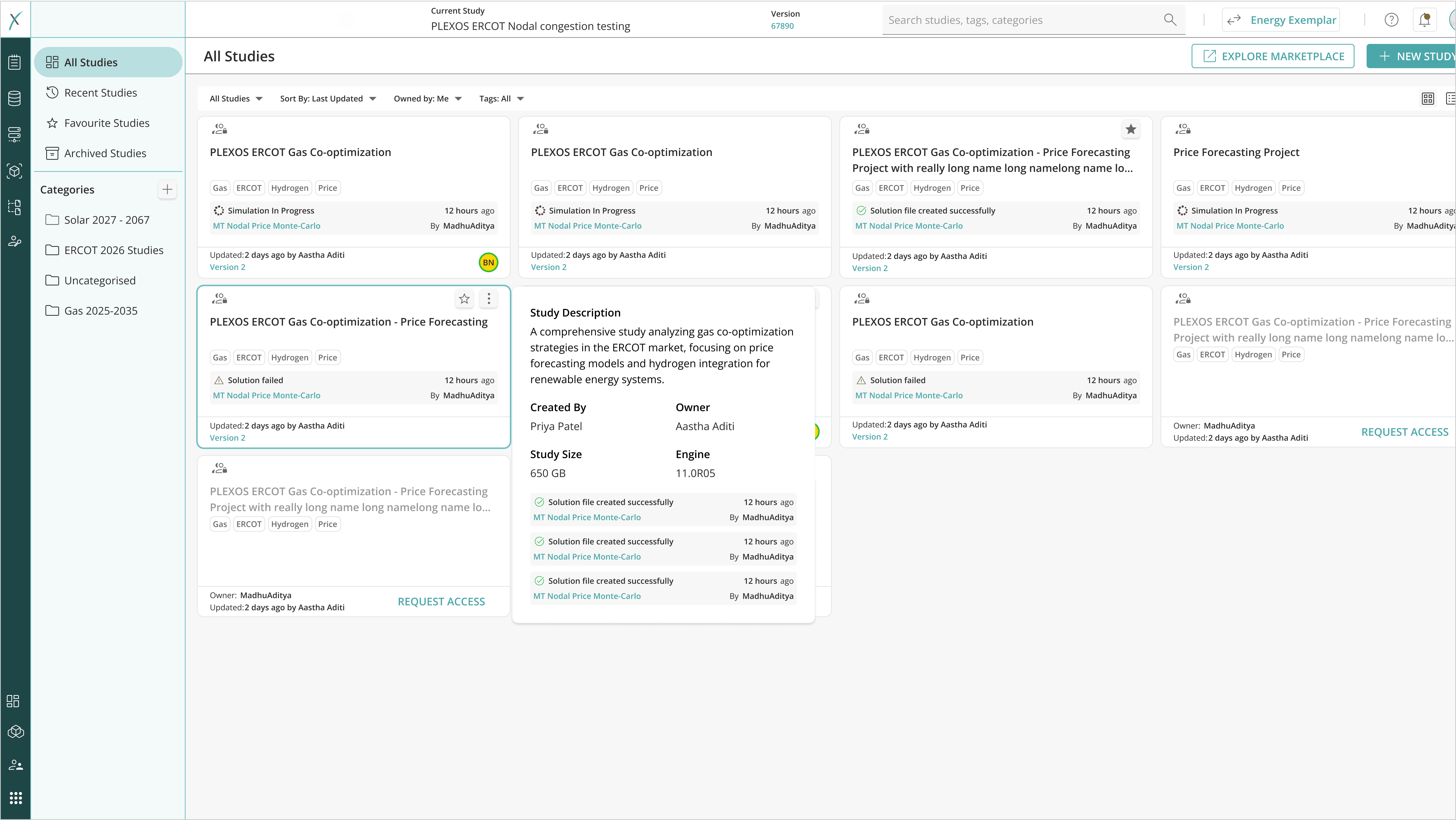
What it delivered, mapped directly to what research surfaced:
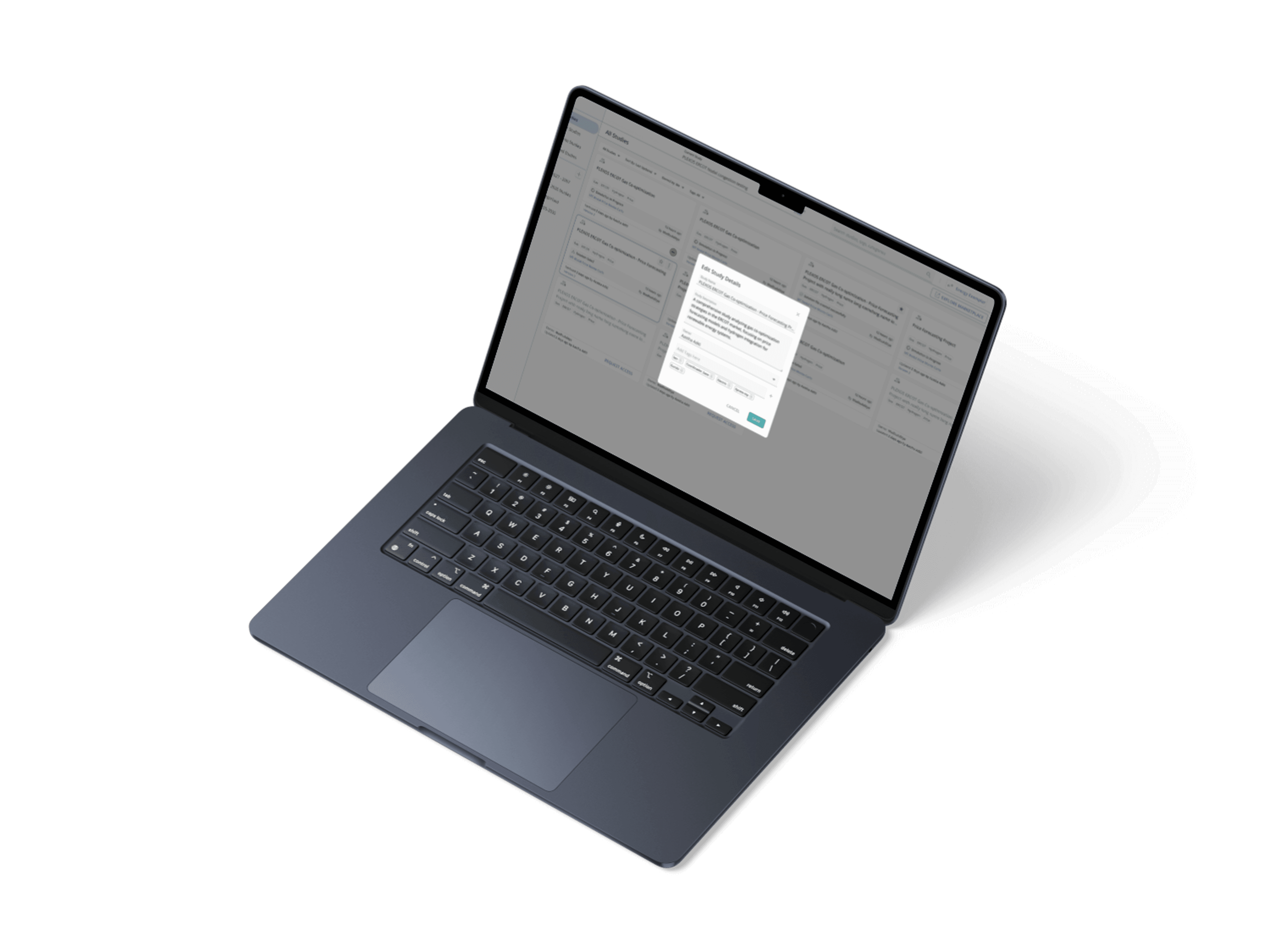
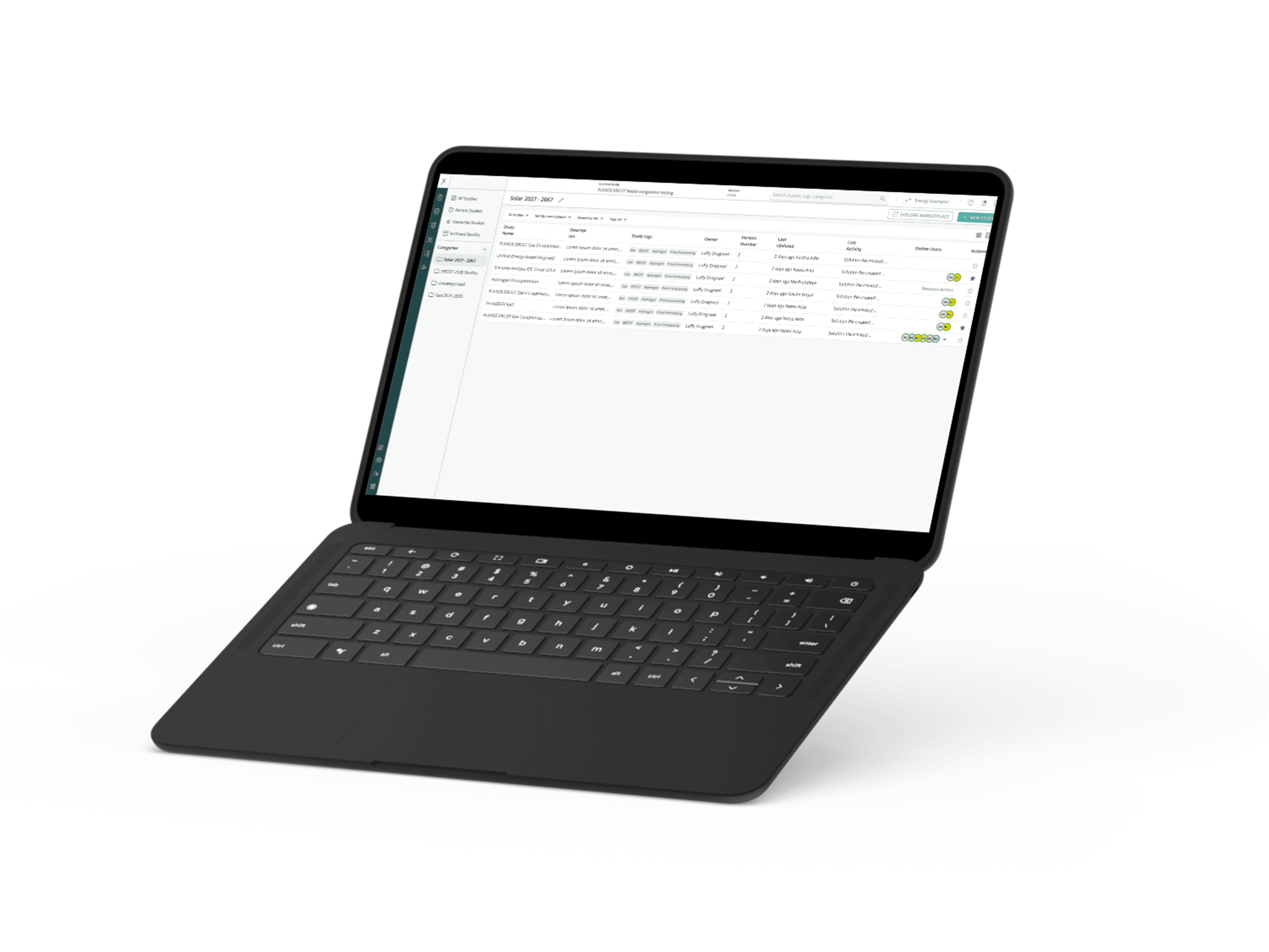
Categorisation: Users could now organise studies into meaningful groups by project, team, scenario type, or any structure that matched how their organisation worked. For teams managing 100+ studies, this was the difference between a searchable and an unusable list. Post-launch, categorisation was one of the features users responded to most positively.
Tagging: A flexible tagging system let users attach their own metadata to studies without requiring a formal taxonomy. Users appreciated the freedom this gave them to build structure that reflected how their team actually worked, not how the system assumed they did.
Self-serve deletion: Previously, deleting a study required a tenant admin. Now, study owners could delete their own studies directly eliminating a dependency that had been a persistent source of frustration. This was mentioned unprompted in post-launch feedback as one of the most valued changes.
Last simulation timestamp on cards: Each study card surfaced when it was last used in a simulation giving users an immediate signal for which studies were active and which had gone stale. Small detail, high utility.
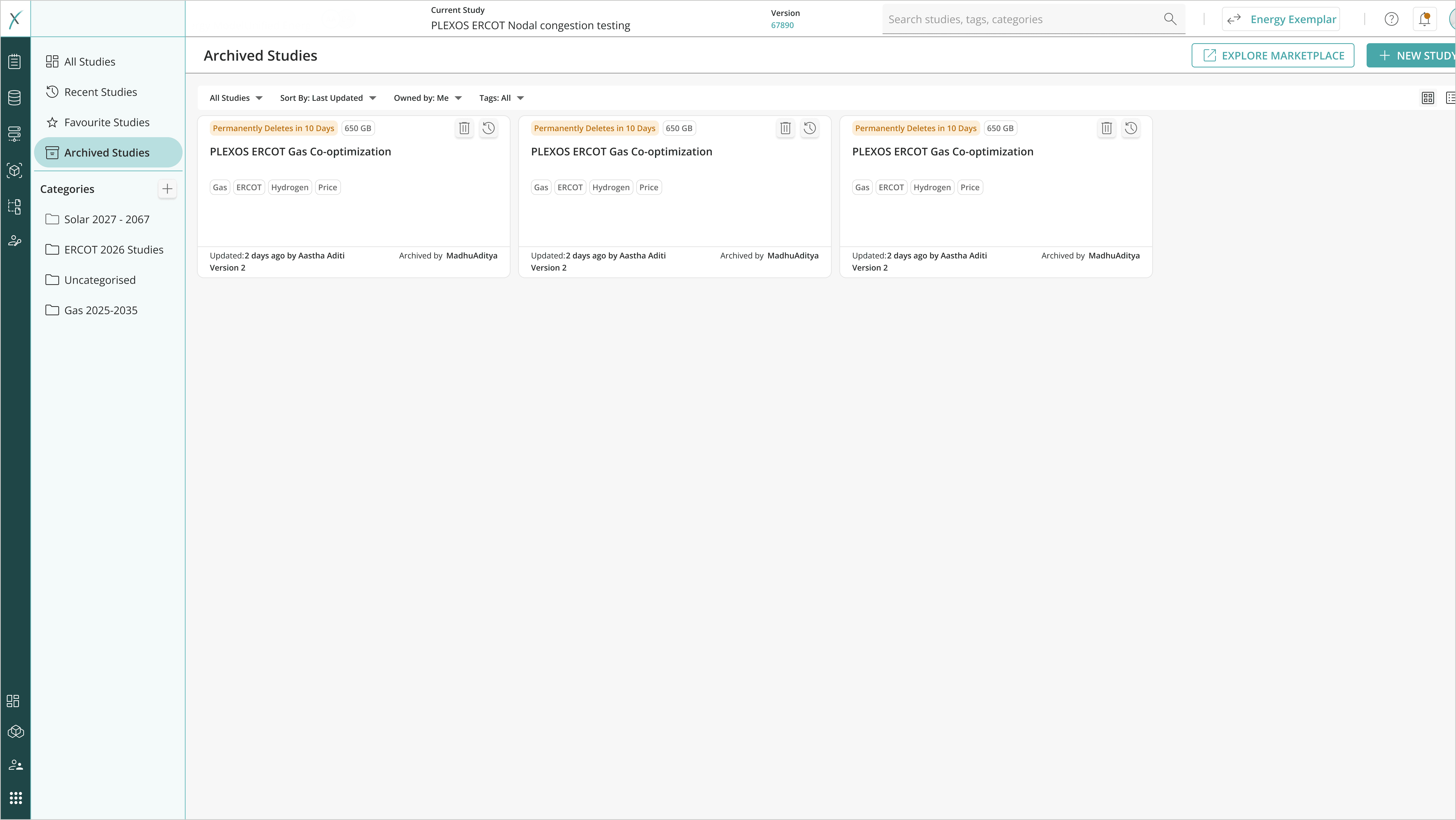
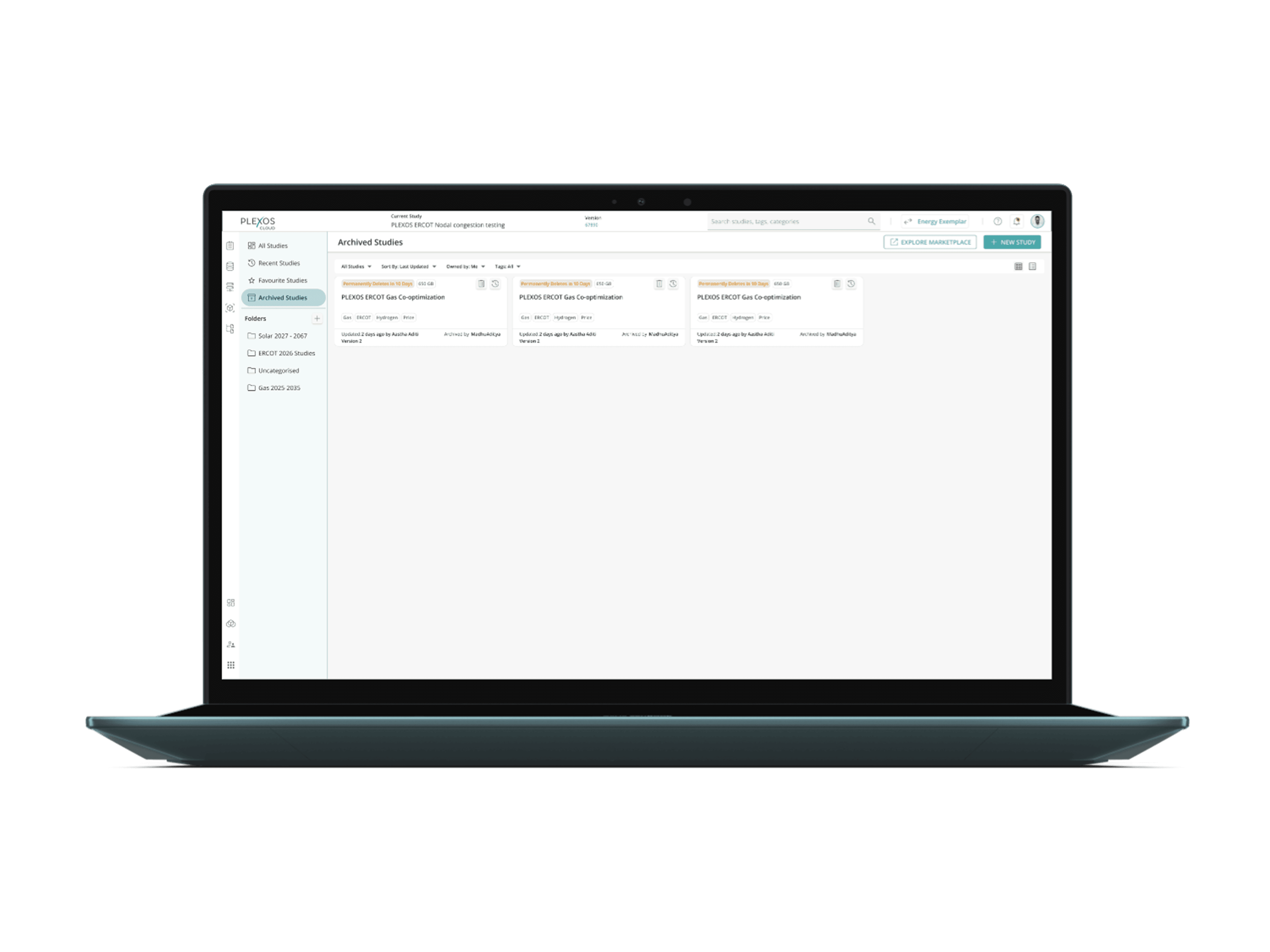
Archiving: Studies that were no longer active could be archived rather than deleted keeping the record without cluttering the active workspace.
RESULTS
Post-launch feedback from users was strongly positive across the core features:
Categorisation: was the standout success. Users managing 100+ studies described it as an immediate unlock for the first time, they could impose structure that reflected how their team actually worked, rather than scrolling through an undifferentiated list hoping to find what they needed.
Self-serve deletion: was mentioned unprompted in almost every post-launch conversation. Removing the dependency on tenant admins for something as routine as deleting an old study had a disproportionate impact on how users felt about the product. Small permission change, significant trust gain.
Tagging: gave users flexibility without prescription they could build their own metadata system without the product forcing a taxonomy on them. It landed particularly well with power users who managed studies across multiple projects simultaneously.
Last simulation timestamp on study cards: proved immediately useful as an at-a-glance signal for which studies were live and which had gone stale. Users didn't have to open a study to assess its relevance — the card told them.
Study status: was the one feature that generated mixed responses. Users found the concept unclear and didn't naturally incorporate it into their workflow. Rather than treating this as a design problem to iterate on, I ran a follow-up focus group discussion to understand the underlying question: how do users actually think about the lifecycle of a study?
The focus group revealed that study lifecycle wasn't a shared concept different teams had different informal conventions, and many had none at all. This reframed study status from a UX problem into a product definition problem. It became a recommendation for a subsequent phase, with clearer conceptual groundwork laid before any new design was attempted.
The launch also gave us an early signal on the dropdown transition strategy. Limiting the dropdown to 3 recent studies successfully nudged a portion of users toward the Study Management page.
WHAT I LEARNED
The most valuable moment in this project wasn't a design decision it was knowing when not to design.
The study status finding could easily have been treated as a prompt to iterate the UI. Instead, the focus group revealed it was a product question that hadn't been answered yet: what does the lifecycle of a study actually mean for these teams? Designing a more polished version of something users didn't have a mental model for would have made the problem worse, not better. Surfacing that gap early and handing it back as a product problem to solve first was the right call.
The other lesson was about the difference between adoption and comprehension. Getting users onto the Study Management page was one thing. Making sure they understood and trusted it was another. The features that earned the most positive feedback weren't the most complex ones they were the ones that directly removed a frustration users had been quietly carrying for a long time. Self-serve deletion. Categorisation. A timestamp that told them what they needed to know without asking them to dig.
Fixing the right small things, clearly, is often more impactful than building the right big things ambitiously.
IDEATION & VALIDATION
Early concepts explored different models for study management a dedicated page, a side panel, an expanded flyout. Each was pressure-tested against the jobs users needed to do: find a study quickly, understand its context, manage and clean up older ones, and share or collaborate within a team.
I presented initial concepts to stakeholders for early alignment to surface constraints around technical feasibility and business priority before investing in high-fidelity work.
After a few iterations, I moved to high-fidelity mockups and ran a usability test with 5 participants deliberately chosen across different user demographics and usage patterns to get a wider range of insight.
Before the live sessions, I ran a pilot review of the designs to stress-test the session flow and catch any obvious issues with the prototype before real participants saw it.
SKILLS DEMONSTRATED
User Research · Pendo Behavioural Analytics · Session Recording Analysis · Usability Testing · Focus Group Facilitation · Information Architecture · Interaction Design · High-Fidelity Prototyping · Stakeholder Alignment · Dev Collaboration · Mental Model Design · Enterprise SaaS · Agile Delivery