Turn Simulated Results into Smarter Decisions.
Data Analysis Suite
COMPANY
Energy Exemplar
ROLE
Lead UX Designer | End-to-End from research to delivery
EXPERTISE
UX/UI Design | Research | Usability Testings
YEAR
2021
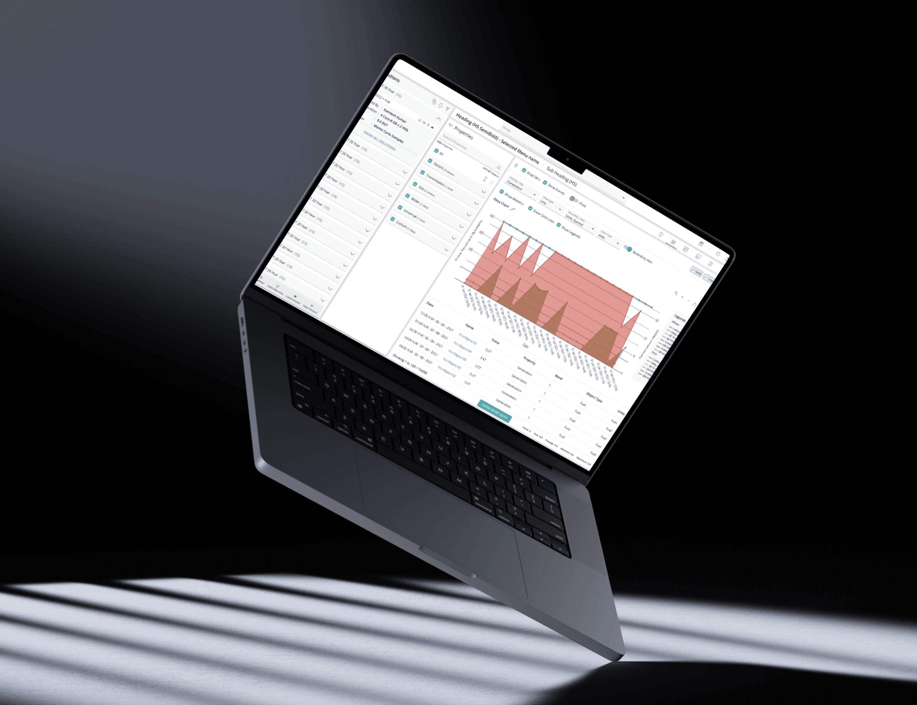
Energy analysts running simulations on PLEXOS were generating thousands of data, and then leaving the product to make sense of them. Within minutes of a simulation completing, most analysts had an Excel file open on a second monitor. The tool had done the hard computational work. The insight work was happening somewhere else entirely.
I know this because I watched it happen repeatedly with the very tool I'd built from scratch.
CONTEXT-THIS STORY STARTS EARLIER
Before there was a suite, there was nothing.When I joined Energy Exemplar, PLEXOS had no in-app output analysis capability at all.
After running a simulation, analysts had one option: stare at a raw data dump, then export it. There was no grid, no controls, no way to make sense of results inside the platform.
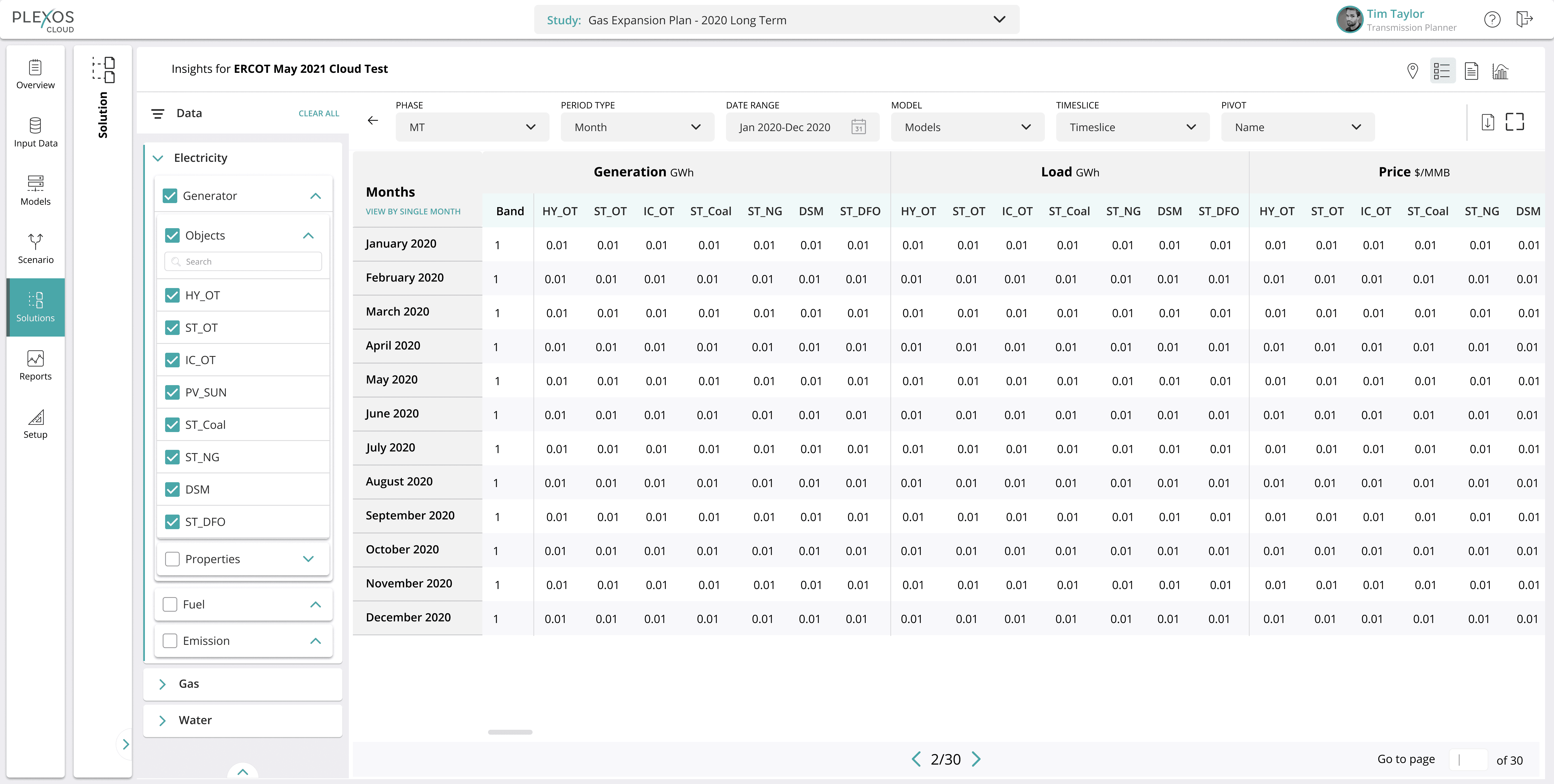
My first project was to design the Output Data Grid from scratch the foundational table that analysts would use to explore simulation outputs. This wasn't an improvement brief. There was no previous version to reference, no legacy patterns to follow. I defined what the grid was, what it needed to do, and how analysts would interact with it.
That v1 grid shipped. Analysts started using it. And over the following months, I watched what they actually did with it , which turned out to be both more and less than we'd expected.
That observation became the entire basis for Phase 2
THE PROBLEM
PLEXOS is not a simple tool. Energy market analysts use it to simulate entire electricity grids modeling supply, demand, generation capacity, and pricing across complex scenarios. After a simulation runs, the output is enormous: thousands of variables across time periods, regions, and objects.
The v1 grid I'd designed gave analysts their first foothold inside the product. They could see their data. But seeing it and working with it were very different things.
The grid was raw, a dense table with no ability to pivot, compare, or visualise. Analysts who needed to generate insights still had one real option: export to Excel and do it there.
This created multiple problems:
Time: analysts spent hours reformatting data outside the platform before any real analysis could begin
Accuracy risk: manual exports introduced version control issues and human error
Adoption ceiling: the more capable PLEXOS became as a simulation engine, the more its output experience became the bottleneck
I had built the foundation. Now I needed to understand why analysts were still leaving and fix it properly.
RESEARCH: WHAT I FOUND
I had an advantage most designers don't get going into a research phase: I'd built v1 myself, so before any interview was scheduled, I went straight to Pendo. What I found was a clear signal that something was wrong.
Average time on the Output Data Grid page was just 3 minutes.
For a tool designed to support deep simulation analysis, 3 minutes meant analysts were either getting what they needed instantly which seemed unlikely given the complexity of the data or giving up and leaving. The export button click rate told me which one it was. It was one of the highest-interaction elements on the page. Analysts were arriving, hitting a wall, and exporting out.
I ran structured sessions with 5 energy analysts: power users, occasional users, and one team lead managing reporting for a regional grid operator. I went in with the Pendo data already in hand, which meant I could ask targeted questions rather than fishing for general feedback.
Four friction points emerged clearly:
1. Property and object selection was exhausting: Before an analyst could see anything useful, they had to select which properties and objects to display. The process involved too many clicks, too many nested menus, and no way to save or reuse a previous configuration. Every session started from zero.
2. The raw data was uninterpretable without intervention: The grid threw data at analysts without any hierarchy or visual structure. To make sense of it, they needed to reshape it which meant exporting to Excel and doing the work there. The grid was a data pipe, not an analysis tool.
3. Pivoting was too limited: Analysts used pivot tables extensively in Excel to slice data across dimensions, time periods, regions, generation types. The v1 grid offered limited pivot option in a dropdown. The moment analysts needed a view the grid couldn't give them, they left.
4. Page loading was driving migration: This one surprised me. Several analysts mentioned that slow load times particularly with large simulation outputs had trained them to leave the page while waiting. Some had stopped returning at all, switching to other parts of the product or external tools entirely. A performance issue had become a behaviour pattern.
What this told me
Analysts didn't need better charts. They needed a grid that was actually workable fast to configure, understandable at a glance, flexible enough to replace Excel for the reshaping work, and reliable enough that they'd trust it. Charts, reports, and BI dashboards were valuable but only if analysts were willing to stay on the page long enough to use them.
The solution wasn't visualisation on top of a broken foundation. It was fixing the foundation so that visualisation would actually land.
THE SOLUTION
Phase 1 (completed prior) : Output Data Grid v1
Designed entirely from scratch. No prior version, no reference product, no legacy patterns to follow. I defined the grid's structure, interaction model, and data display logic from the ground up — what gets shown, how analysts select it, how the table behaves, how data is exported. This shipped in 2021 and became the first in-product analysis tool PLEXOS had ever had.
Phase 2 — The Analytics Suite
Each feature in Phase 2 maps directly to a friction point from research. The sequence was deliberate: fix the biggest drop-off first, then layer capability on top of a grid analysts would actually stay on.
Problem 1: Property & object selection was exhausting
The first thing an analyst had to do when opening the grid was configure what to display which properties, which objects, which time periods. In v1, this was a multi-step process of nested menus and repeated clicks. There was no memory, no shortcuts, no way to come back to where you left off.
The fix was Saved Layouts, analysts could now store their full configuration (properties, objects, filters, view preferences) and restore it in a single click. What had taken 10–15 minutes of setup at the start of every session was eliminated entirely.
Post-launch, saved layout usage came in higher than any other feature in the suite. It was the least glamorous thing we shipped, and the one analysts used most.
Problem 2: Raw data was uninterpretable
The grid threw data at analysts without hierarchy, structure, or context. To make it readable, they'd been reshaping it in Excel, adding their own groupings, formatting, colour coding. The tool gave them data. It didn't help them think with it.
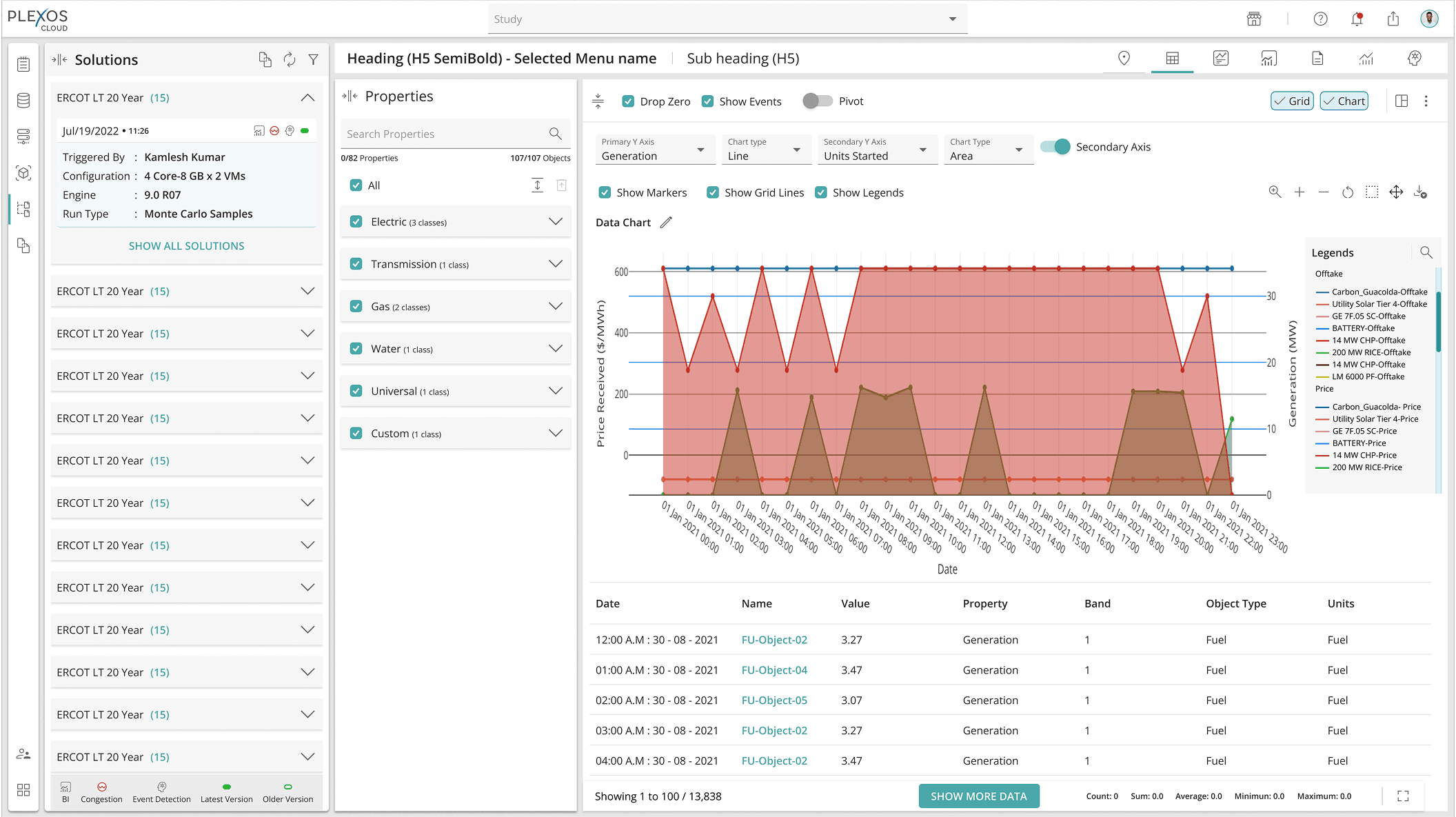
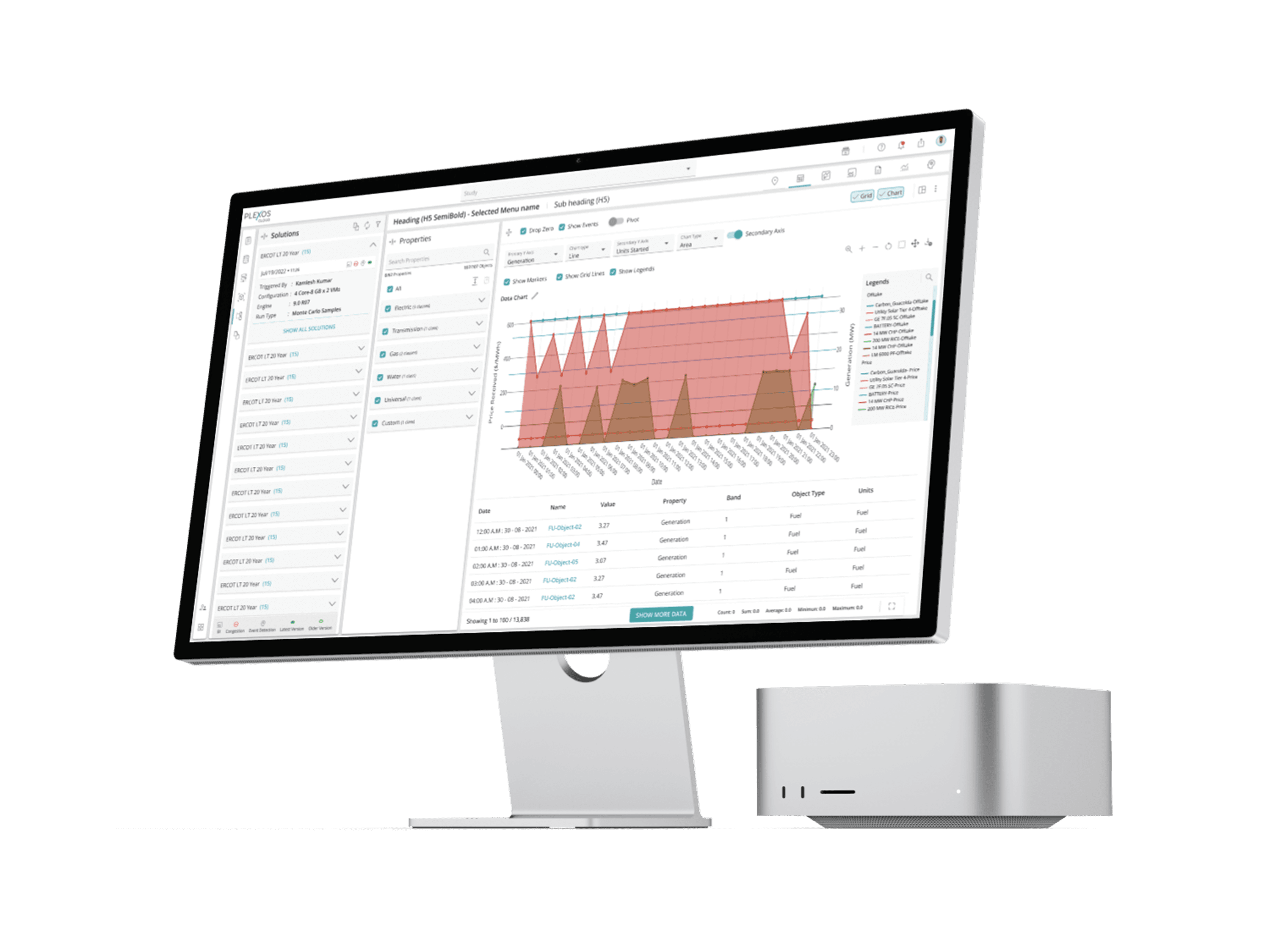
The answer was visualisation, but not as a replacement for the grid, as a live companion to it. Integrated charts sat alongside the data in a dual-pane view, responding dynamically to whatever slice of data was active in the grid. Analysts could see the number and the trend simultaneously without switching tools or exporting anything.
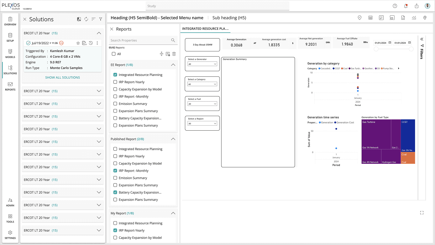
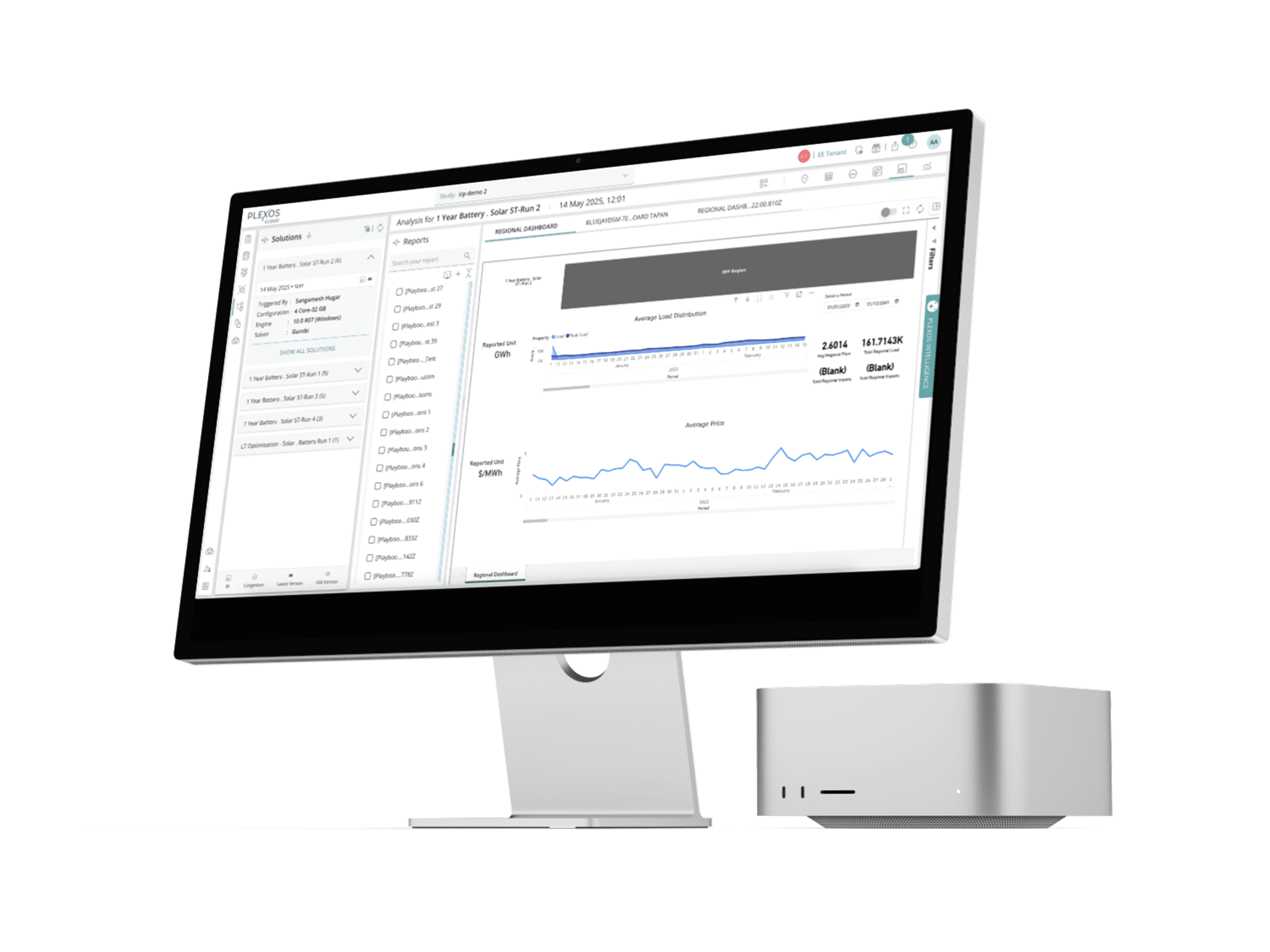
For teams that needed to present findings upward, BI Analytics connected PLEXOS outputs to Power BI, enabling dynamic dashboards for stakeholders who would never open PLEXOS directly.
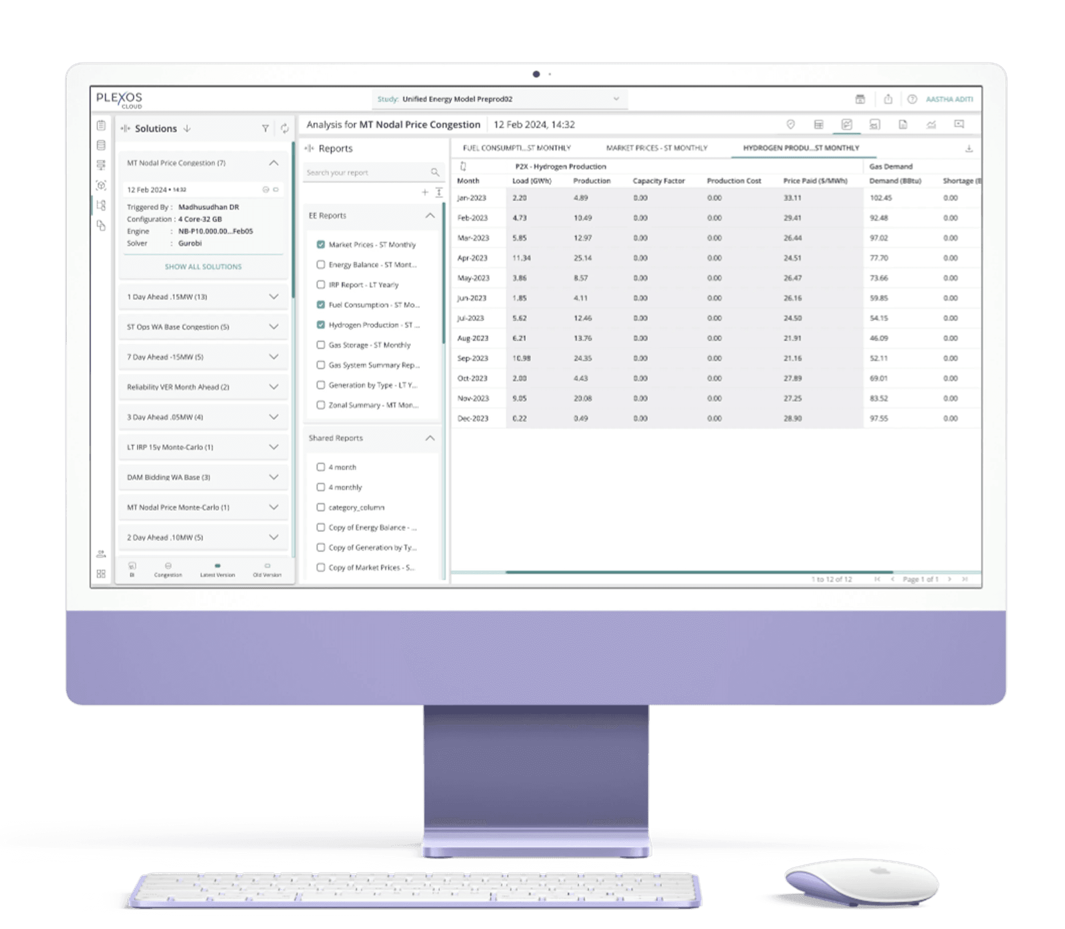
And for the recurring task of packaging simulation outputs into shareable documents, Solution Report templates gave analysts structured, ready-to-use formats eliminating the manual copy-paste-into-Word step that had been eating time across every team I'd observed.
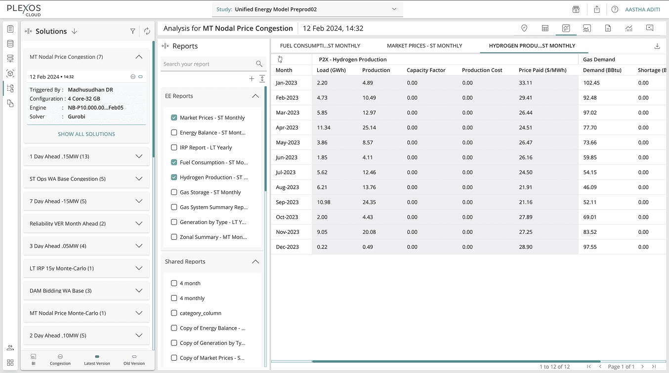
Problem 3: Pivoting was too limited
Analysts were power users of Excel's pivot tables, slicing data across time periods, regions, generation types, and object categories was core to how they worked. The v1 grid offered limited pivot capability. The moment an analyst needed a view the grid couldn't give them, they left.
Enhanced pivot controls closed that gap, rebuilt to reduce click depth and support the full range of dimensional slicing analysts were used to doing in Excel. The goal wasn't to replicate Excel. It was to remove the reason to open it.
Problem 4: Load times were training analysts to leave
This was the friction point that didn't show up in any feature brief, it emerged purely from interviews. Slow load times on large simulation outputs had conditioned analysts to navigate away while waiting. Some had stopped returning to the grid at all.
Performance improvements were addressed in collaboration with engineering as a parallel workstream , not a UX feature, but a prerequisite for everything else to land.
DESIGN PROCESS
Phase 1: Grid v1 (from scratch)**
Discovery → problem definition → information architecture → interaction modelling → wireframes → high-fidelity design → dev collaboration → ship. Every interaction defined from first principles, validated with analysts, iterated with engineering.
Phase 2: Suite
Pendo analysis: 6+ months of v1 usage data reviewed before any interview was scheduled.
Structured research: 6 interviews and workflow observation sessions. Four friction points mapped to design priorities.
IA & flow design: restructured the output analysis section of PLEXOS to accommodate new capability layers without disrupting existing navigation patterns.
Wireframes → validation: two rounds of concept testing with 5 analysts from the original research cohort. Heaviest iteration on property selection flow and pivot interaction.
High-fidelity prototyping: delivered in Figma. Usability sessions run on prototype before handoff.
Dev collaboration: embedded in sprint reviews throughout. Three significant gaps between design intent and engineering interpretation identified and resolved before release.
Post-launch: feature adoption and session behaviour tracked via Pendo.
RESULTS
The clearest measure of success was session time. The benchmark that had started Phase 2, analysts spending an average of ~3 minutes on the grid before leaving , shifted meaningfully after launch. Analysts were staying longer and returning more regularly, which indicated the grid had moved from a transitional step to a primary workspace.
Specific signals from Pendo post-launch:
Saved layout usage was the highest-adopted feature in the suite , confirming that configuration friction had been the biggest barrier to regular use
Export button click rate dropped the most direct measure that analysts were finding what they needed inside the product rather than reaching for Excel
Report generation saw consistent uptake from team leads, matching the "sharing findings with non-technical stakeholders" job identified in research
BI Analytics adoption grew steadily among power users managing regular reporting cycles
WHAT I LEARNED
Building v1 gave me something most designers don't have when they start a redesign: I knew exactly where the cracks were, because I'd put them there. The Pendo data confirmed what I'd suspected. The interviews told me why. That combination, quantitative signal pointing to qualitative cause is the fastest path to a design decision you can actually defend.
The broader lesson was about sequencing. Each layer of the suite only worked because the one underneath it was solid. Saved layouts only mattered if the grid was worth returning to. Charts only landed if analysts trusted the data they were visualising. Getting the order right was as much a design decision as getting the features right.
SKILLS DEMONSTRATED
Phase 1: Product Design · Information Architecture · Interaction Design · Enterprise SaaS · Dev Collaboration
Phase 2: Behavioural Analytics (Pendo) · User Research · Jobs-to-be-Done · Data Visualisation UX · Interaction Design · High-Fidelity Prototyping · Stakeholder Alignment · Agile Collaboration · Cross-Functional Influence